Overview
Pega Community brings together forums, events, training, and support under one umbrella. The dashboard creates one clear place to see what matters and needs action. This is my growth story, from being a Figma operator to a thoughtful UX Designer, who asks questions and digs into what really matters.
Phase 1 · 2023
Before any design work began, I ran a mixed-method research phase to understand navigation habits and uncover the friction hiding behind them.
Survey · approximately 100 participants - focused on navigation habits, deliberately avoiding the word “dashboard” so responses were not primed.
In-person interviews · 5 participants - surfaced friction the survey data could not explain on its own.
Empathy maps and personas - kept user motivations front and center throughout the work.
Key insight
Users weren’t failing to find content; they were constantly context switching and losing track of what needed their attention.
What I got wrong the first time: stakeholders wanted everything on the dashboard, and I accepted that framing. I focused on making it look organized rather than questioning whether it should all be there. The result was visually structured but cognitively heavy - no clear hierarchy of what actually needed attention. For reasons beyond my control the project was deprioritized before development.

Early dashboard iteration - visually organized, but still cognitively heavy and unclear about what truly required attention.
Phase 2 · 2025–2026
When the project returned, the brief was to stay close to the earlier proof of concept. But the old structure was no longer defensible, so I made the case for a different approach.
A new constraint: two dashboards, not one. A separate manager dashboard was being built in parallel, so I ran a tree test to learn where users expected to find information on the Community dashboard, the Manager dashboard, or their personal profile. The results shaped the scope directly.

The redesigned dashboard prioritizes the actions that matter most, rather than everything users could possibly see.
The core shift: from “show everything” to “show what needs action.”
Academy - all in-progress trainings are visible, with overdue and near-completion missions prioritized. Completed training moved to the profile under Enablement Achievements; GA4 showed that the old page received only 0.6% of traffic.
Events - registered events plus personalized recommendations. The browsing page already has strong standalone traffic and does not need to be replicated here.
Support - only tickets requiring user action. Full history stays on the Support page.
Forums - replies, mentions, and “hot in your expert circles” encourage participation without duplicating notifications.
Header - notification badges per widget and a recognition progress card showing proximity to the next tier.
What I learned
The hardest conversations were internal: convincing stakeholders to cut features and explaining why less content can mean more value. Data helped - the 0.6% traffic and the tree-test results moved discussion from opinion to evidence. This project also gave me the rare chance to look at my own past work with fresh eyes. The second dashboard is fundamentally different in philosophy, not just execution.
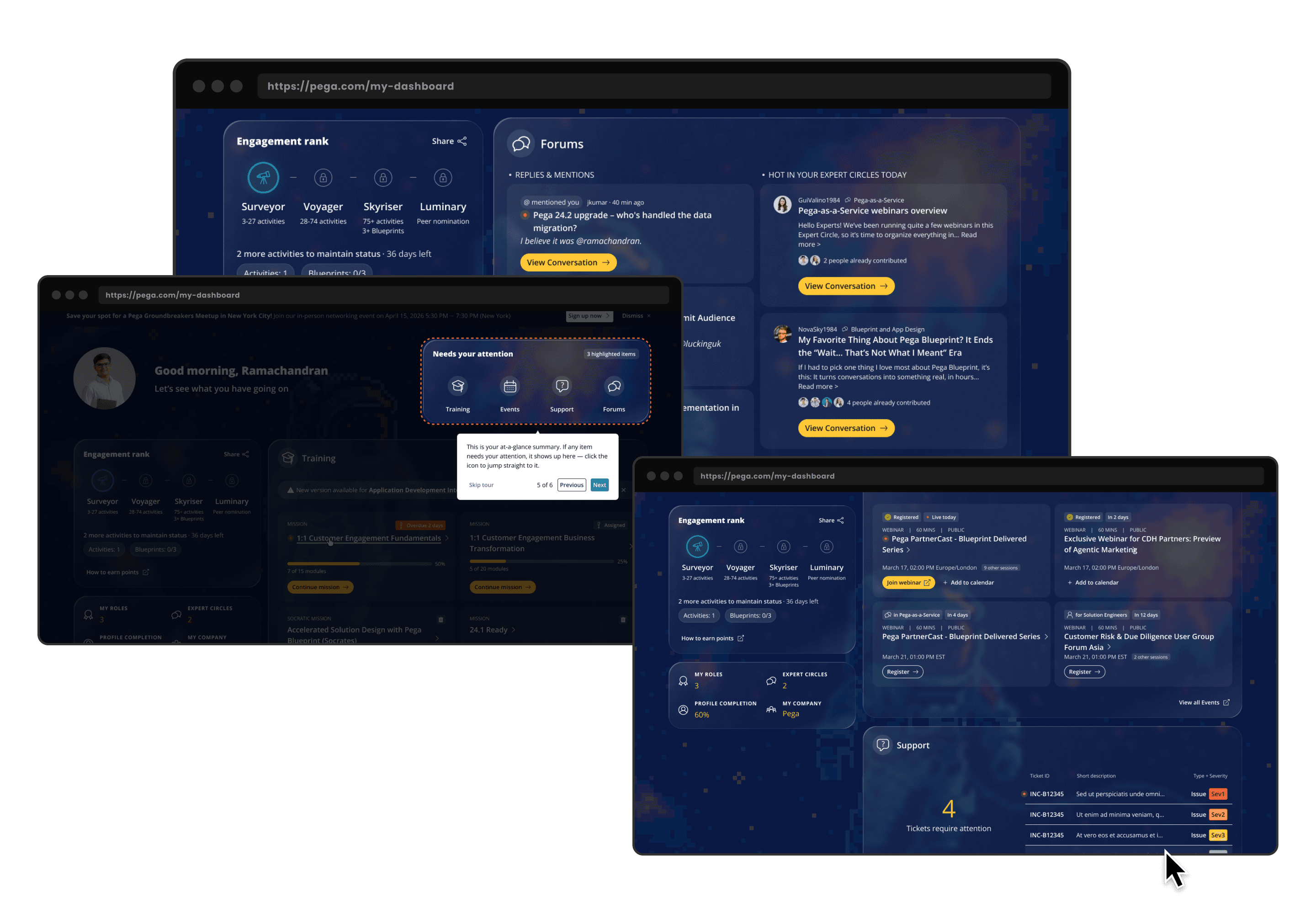
Different views of the Dashboard, showing part of the onboarding tour and the rest of the widgets.